Sunday 24 August 2014

Tutor Feedback: Assignment 5

Tutor Feedback Assignment 5

Overall Comments
Thank you for submitting Assignment Five for Drawing 1. You are clearly moving forward to working more independently outside as well as within the restrictions of the course and you have produced yet again a full, enquiring and well developed Assignment. Your learning log is well written and I really enjoyed your essay where you pooled varying ideologies and theories together alongside contemporary art and the wider cultural platform. The work you have submitted around the human form is just beginning to expand in terms of its physicality. You appear to be moving away slightly from traditional drawing techniques using varying materials to get your ideas across.
You have submitted a wide range of work for this assignment and have clearly worked extremely hard throughout to produce interesting and varied outcomes. Well done


Feedback on assignment
Demonstration of technical and Visual Skills, Quality of Outcome, Demonstration of Creativity
 You have started off well reflecting on all of Drawing 1 to date with levels of enjoyment, which has given you a good overall idea about you and your studies, your preferred approaches and subjects as well as materials. You have been very analytical in your approach and have therefore decided to expand further with option 4, drawing Figures. You have reflected well on your study week looking at various approaches to making work in varying contexts and it is good to see you putting work that you feel is less successful on the blog.

Exercise: Quick Studies
You have produced a number of very fluid sketches of your model using ink. The drawings that have been reduced in line are confident, enquiring and personally challenging. The sketchbook work where you have produced quick line drawings from the performance Tableaux Vivantes are really very personal representations and it is good to see that you have represented images to reference the storytelling alongside. You have managed to capture movement and gesture well and the sense of character is different in every one.

Your critical review of the work is interesting in terms of recognising that total immersion in the subject and representing the figure in its most simplest and possibly its most creative and challenging way. It is good to read that this is happening, as it is certainly part of the creative process.

You have made some great notes from your research to a trip to Denmark which are contextually relevant, extensive and well critiqued. You page in your sketchbook where you have drawn Rodin’s kiss demonstrates your creativity and critical decision making from start to completion in terms of reduction of line. Well done.

Exercise: Line drawing of the whole figure
For this exercise you have selected to draw your son Luigi. The stance of the figure is well observed with his weight falling on his elbow and the awkwardness of a teenage pose is reflected well within this drawing. The torso and scale is good and you have really grasped the foreshortening of the leg well, which suggests that your measuring techniques have worked and you have pushed your learning forward. The hands could have been a little bigger but overall the gestural mark making is confident, energetic, reductive and creative, so well done. Aspects of tone could have been enhanced for added weight and volume. You then continued with a series of quick experimental drawings using oil transfer techniques, which suggests your level of enquiry continuing on from the demands of each exercise.

Research point: Ingres, David, Degas, Giacometti and Hockney
Your summative research from 'The Linear Economy' in 'The Primacy of Drawing- Histories and Theories of Practice' is very good. You have referenced a number of contemporary artists whilst considering line and what this may mean to artists extremely well in terms of summative content. The artists and their cross over influences have been researched very thoroughly and with a high degree of competency. Yet again, you demonstrate high levels of understanding and critical evaluation throughout your personal research, so very well done overall.

Exercise: Using colour
You have produced a number of colour studies for this exercise. The strongest is the watercolour drawing of your husband cleaning his teeth. You have managed to use colour well to suggest form, light and tone and the torso and stance of the figure works very well. Particularly strong areas that work well are the legs, feet, shoulders and cast shadow. The head is perhaps a little too pink when compared to the rest of the form but I would suggest that you take time to pursue this approach and medium more, again in a reductive sense perhaps to evoke emotion. Well done.
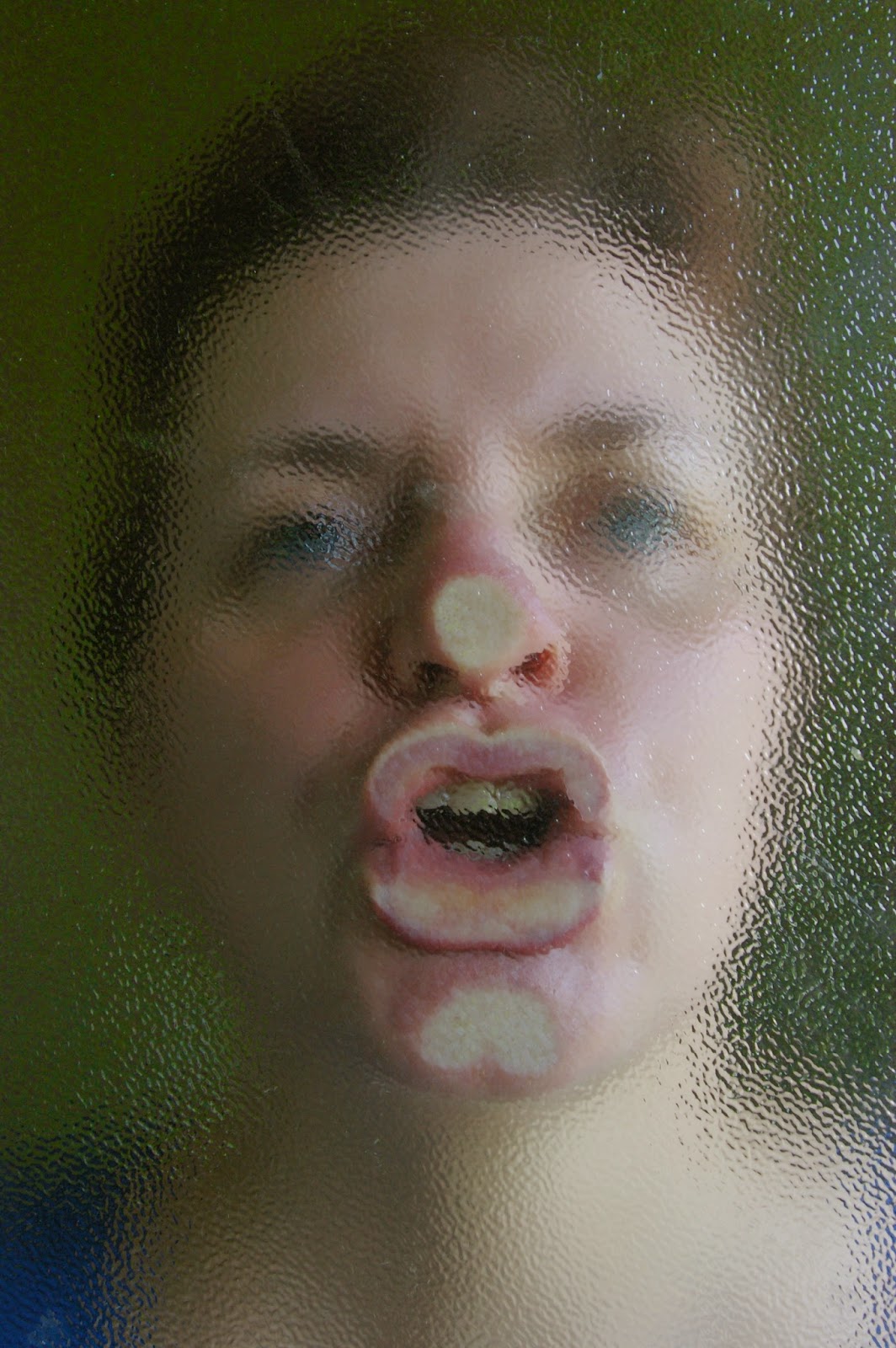
The studies of your eye, nose and mouth using coloured pencil are again quite competent. As stand alone drawings they are interesting and enquiring in terms of studies of the self. Do you know the work of Miranda Whall? http://www.mirandawhall.com/ Her work is similar in drawing terms (the subject much more shocking perhaps) and she often references animals and nature but her craftsmanship is really quite astounding. I think you may find her practice, if you don’t know it already, of personal interest.

Your final drawing references colour and tone well. It is good to see you considering what drawing can be as an artist. Would you then be interested perhaps in drawing more conventionally from this collage? That could be quite compelling to the viewer if close up the ‘collage’ was really a drawing in its traditional sense.
You have produced good personal critique throughout this submission on your blog.

Exercise: Tonal study
You have submitted a good range of drawings looking at tone, varying grounds and under good light. The proportions of the faces are not too bad overall and it is clear that you have understood the demands of the exercise. The most successful drawing in terms of depicting light, mid and dark tones overall is the drawing you struggled most with, the drawing of your son Luca. Despite the slight overuse of white, the varied mid tones of his cheek and jaw line really give the portrait depth. Despite the lack of likeness to your son, this drawing works very well in terms of proportion, measurement and its overall balance in terms of understanding facial composition. The drawing of your husband Luigi works well on the right hand side in regard to the position of the features but the eye on the left is much further out to the left hand side of the face. The gap between the bridge of his nose to the eye socket would need further observation and measurement to be more accurate however the rest of his features and very convincing. Make sure that when measuring you keep your arm out straight and is 900  away from your trunk/torso. A good way to do this sometimes is to place a mirror tile centrally and vertically down the centre of the head to see how the two halves should look. It may also be easier to place a blank piece of paper over one half of the face and photocopy, flipping it to the left. Doing this on tracing paper can allow you to see the misalignment easier. Make sure that all the measurements are made carefully before filling in any other information as you go. The most likely cause is that you drew one side of the eye and then shifted position slightly to draw the other half which has allowed the left hand side eye to move both across and upwards slightly. This of course takes a great deal of practice but there are some good instructional videos about measuring the face (and figure) online if it helps.

Assignment 5
Preliminary Research and ideas
You have started off this assignment by mind mapping your ideas and thoughts on how to get the most of this final assignment for your own personal progression. Again, as your work is often driven by good contextual research, your thoughts about the artist Michael Landy and his drawings around his father’s state of health was enriching to see when placed against your own drawings on a black ground. Your thoughts around the feminine and all that that entails works well and it great to see a great deal of independent thought and process drive work being made. Despite your reservation about the last drawing relying heavily on what you know already, as you move through these courses you approach to making work may be less demanding in terms of process driven but more driven by causality, so don’t worry about this too much if this happens later on, it may be a preferred way of working. You are clearly thinking and questioning everything you are doing and that is the most important part of what you do.

You have written a compelling and deeply thoughtful essay on and around narcissism, including relevant contemporary practice and theory. You may be interested in the artist Erica Eyres http://www.ericaeyres.com/  and the artist Liv Pennington http://www.livpennington.com/

Initial Sketches
You have submitted a good and varied number of studies looking at depicting the human portrait by drawing 50 drawings in 4 hours. Drawing reductively in line on tracing paper then further develops these. The layering idea depicts expression well and allows the work to take on another dialogue. You then move on to develop a series of more emotive drawings looking at facial expression and distortion. The images you have submitted are easy to read in terms of development, so well done so far. Experimenting with monotypes moves the work in further in terms of working with oil based smears – a great idea with some very productive outcomes. It would be great to see this theme continuing much further and contextually fits very well into your critical personal research. These haunting images work well.
Your thoughts around he face as a marker of subject experience is an interesting read and your visual representations and creative and exploratory. For me the work feels a little lost (this may of course have been your initial intention). The visuals continuing under the title ‘Obfuscation’ however, feel much more coherent. You have produced a number of abstracted images that are extremely curious if not a little frightening, that work extremely well as a series. Your enquiries are investigative and wide-ranging throughout as you try out new things using varying techniques and processes.

Sketchbooks
Demonstration of technical and Visual Skills, Demonstration of Creativity
You are clearly working well in sketchbooks. You are clearly engaged with the course and are embedded in your own investigative enquiries throughout this assignment both in and out of a sketchbook. It could be interesting to see if you would feel comfortable working to a theme in a sketchbook now that you are starting to consider a more research based practice. I am in no doubt that your energetic and contextually engaging work will continue onto further study. You annotate well throughout and work in a personal, intuitive and independent way from an idea, through to development and conclusion in terms of the visual.


Learning Logs or Blogs/Critical essays
Context
Again an extremely enquiring, mature and dynamic learning log has been submitted. Despite the fact that you have had to work with a very tight deadline the written work is extremely well written, coherent and of a high standard. For me the work you have submitted for this final assignment is over and beyond the exercises set and it is clear that you have a great ability to push yourself hard in terms of your reading and researching across art theory, cultural references and personal outcomes. You have clearly research a significant number of contemporary artists as well as historical in support of your own ideas and you are very good at unpicking and reevaluating the work of others against other writings. You have submitted a coherent, highly developed and personally demanding account of your learning thus far with good critical and evaluative skills throughout.

Suggested reading/viewing
Context
I have suggested some further artists for you to look at in reference to your thoughts about the human gaze, the female, the feminine and the narcissistic. I am in no doubt that you will continue your own personal studies and enquiries, as you are a highly competent student who works well independently. Continue to read and review articles that are of interest to you. You my wish to read aspects of e-flux http://www.e-flux.com/ to which you can subscribe to enhance both yourself and your academic studies.

Pointers for the next assignment
You may wish to continue a series of sketchbooks on varying themes around the sense of the feminine. You can easily produce one a week and you may wish to include writing within that. I would like you to consider the written word within your own work and continue to work reductively as you do so. Always take a step back from the work and ask yourself if you are being too literal, whether your work is pushing you on a personal level and if it feels ‘successful’ on personal terms. Continue as you are and I am in no doubt that you will flourish in terms of written critique, push some of those working ideas further in terms of professional develop and of course, keep going to see shows or performances that take you out of your comfort zone.

Good luck with the assessment and if you need any help, then please feel free to email me.


Tutor name:
Hayley Lock
Date
24.08.14
Next assignment due
n/a


Tuesday 19 August 2014

Reflection on Assignment 5 and the Course in General

I feel as though I have come a long way over the duration of the course. I have struggled at times with personal and health problems which has meant it has taken me longer to complete than I would have liked, but I'm glad I stuck with it. There is so much more that I would like to do/learn/study but I have completely run out of time for this course. I really want to get stuck in to my next course straight away. I am thinking of studying POP1 and then Introduction to visual culture (or vice versa) as some of the research I have done has been fascinating and I'd like to learn more.

I came to the course not having drawn for many many years .My knowledge of art history and contemporary art was minimal although I'd always had a vague idea that someday I'd like to find out about it. I have learnt an enormous amount both in terms of development of technical skills and in terms of understanding the context of drawings produced today. However, this course has only scratched the surface and has made me aware of just how little I know and how much more there is out there to investigate. I am filled with enthusiasm and would love to move forwards.

Reflecting on the current assignment I think that I have demonstrated technical skill to an adequate level. I have continued to research and analyse (although at times I have out of my depth and had to swim back to the shallow end). I hope that I have demonstrated creativity in my sketchbook experiments although I am acutely aware that my attempts to represent subjective experiences in my assignment have used somewhat clunky and unsophisticated symbolism - I am very new to this process so can't expect to run before I can walk.

I am quite nervous about the prospect of being assessed as I think like most beginners I am very close to and have a lot invested in the work. I have absolutely no experience of being assessed in a fine art context and how my work might compare with that of students in the first year at other universities. Ultimately I hope I have done enough to pass the course. However, the final mark received is much less important than the experience itself which I feel has been very worthwhile whatever the outcome. 

Wednesday 13 August 2014

Frida Kahlo at the Scuderia del Quirinale, Roma


I visted this exhibition in Rome bacause I had researched Frida Kahlo for my previous research point on self portraiture as self potrtaits were a large part of Kahlo's Oeuvre. She made a motif of her face which is immediately recognisable with its monobrow and moustache. I bought and annotated some postcards of the works I had seen at the exhibition. Frida was heavily influenced by european surrealists as well as being interested in aspects of Mexican and pre-colombian culture and the postion of women in mexican society.

Many of her works are colourful and bold and there is always underlying symbolism in the lements she introduces into her composistions. However, one of my favourite works in the exhibition was one of the less ostentacious and less well known self portraits " Self Portrait with Necklace" 1933. Frida's face is as it always is with her signature facial hair. However, the colours in this are muted. This  work has a quiet intesity about it. Her gaze is piercing and very serious. There is symbolism to the use of the necklace made from pre-colombian beads which expresses a link to her ancestors. 

I made notes on a number of the other paintings in my A3 Sketchbook. There are some quite challenging works in the exhibition including an extching entitled Frida and the abortion.  
I was surprised to find that some of the most overtly sexual paintings she did were in fact her still lives. Many of them include phallic shaped fruit and vegetables and fruits opened to reveal their fleshy parts. One example of this is "The bride who is afraid at seeing life opened" - there is clear sexual innuendo here. There is the hairiness of the coconut and the phallic bananas. The watermelon and the papaya are split open to reveal their juicy interior parts. A small doll wearing a bridal gown peeks out from behind the watermelon afraid of losing her virginity. I'm not sure what the significance of the owl is - perhaps he signifies wisdom and is there to guide her. However, often in Kahlo's paintings the animals  have different significances derived from ancient Mexican and pre-Colombian traditions and  deities.


Monday 4 August 2014

Assignment 5: Obfuscation

In further exploration of obfuscation as a concept to indicate the fact that people tend to overlook middle-aged women I asked Luigi to take photographs of my face as I progressively moved back from a sheet of frosted glass. I started with my face pressed up against the glass referencing Ana Mendieta and Jenny Saville. The photographs are included at the bottom of this post. They become visually quite exciting as I become more obscured. I then explored various ways to interpret these images in drawing but without trying to literally transcribe what I saw.

A3 Pastel on Bockingford Textured Watercolour Paper

Detail: Aquamarkers on Cartridge Paper


Out of Focus Photograph - Coloured Pencil on
Dark Ingres Paper
Coloured Pencil on Dark Ingres Paper


Coloured Pencil on Ingres Overlaid with Tracing Paper

Oil Pastel on Bockingford Paper.

I thoroughly enjoyed this exploration. The trouble is, that I could continue mark making experiments forever without ever reaching a resolution and I have now  almost completely run out of time so I'm going to have to stick with the (rather self-indulgent) drawing on the previous post as my final assignment and hope for the best. 


*Update*
See previous post - While my work was in the post to my tutor - in the remaining two days before the deadline for the end of my course I decided to work on a larger drawing for this series. Being last minute I didn't have a large enough sheet of dark paper so used a mid toned paper which necessitated more work on the background. This is a bit overworked and therefore less mysterious (and less disturbing) compared to the original sketches but the sketches are too small to meet the criteria for assignment 5. Nevertheless - I think that this drawing is more 'me'. Not in the sense that it's a better likeness but in the fact that it was drawn more instinctively without so much thinking. It also show my love of colour - so in the end I've decided to submit this as assignment five for the formal assessment in November, This is a calculated risk as my Tutor has not seen this, but overall I feel happier with this than the multilayered monochrome drawing I had originally designated as assignment 5.


Friday 1 August 2014

Assignment Five: Face as a marker of subjective experience

During my preliminary research for the assignment I was particularly struck by John Currin's 'Moved Over Lady' which speaks about the anonymity of middle age. I decided to use this as a starting point to express something about my own experience of being a middle-aged woman. I started with a straightforward line drawing of my face. I am looking directly into the mirror and what I see does not please me. I think you can see disappointment and defeat in my expression. I have kept the drawing straightforward with minimal shading to preserve the grey ordinariness and nondescriptness of the subject.

A2 Graphite

I remember my mother telling me when she was in her mid 40's that middle aged women become invisible. At the time I was in my mid 20's and I though she was being ridiculous. However, as I have reached my mid 40's and passed through the menopause my experience has been the same. Younger people really do sometimes look straight through you as if you are completely irrelevant once you stop conforming to the ideals of youth and beauty imposed by society. The simple collage below was my first attempt to express this. I am in the corner concealed under tracing paper- sidelined, invisible, irrelevant.

A2 Collage


I decided to experiment with this further - I thought I could make a drawing rather than a collage and alter the composition such that I was sidelining myself to a a large and featureless background. My first attempt at this wasn't particularly successful as I had overdone the subordination of my figure. I left this and came back to it later.


Compositional Sketch in A2 Sketchbook
The next couple of drawings explores the fact that people don't see me clearly. The first one goes back to the image of the selfie that I used for my collage in the 'using colour' exercise. I have my chin lifted up trying to disguise my weak double chin and wrinkles - trying to look young, strong and attractive. I have repeated the same contour drawing over and over again with on sheets of acetate and fixed them slightly offset from each other which blurs the outlines. I cannot be seen clearly.
Marker Pen on Layered Acetate A4
My next drawing was made using oil bar on tracing paper with a but of graphite embellishment. This explores the fact that the onset of middle age for me coincided with moving to another country and being unable to express myself clearly in my second language. This meant I was unable to compensate for my reduction in physical attractiveness by being ferociously intelligent! I drew a straightforward portrait here and then wiped away the mouth leaving just a smear to signify my lack of voice. The image is viewed from the reverse side of the tracing paper to make my portrait less clear.  I also considered doing a further drawing in which my mouth was filled with black solid material to signify the fact that when you are not fluent in a language words feel solid and unwieldy.
Oil Bar and XL Graphite Stick on Tracing Paper
The other way in which I could have developed this concept would be to draw a portrait of myself and then erase it in a performative drawing exercise. Since I will never be a Willem De Kooning or Robert Rauschenberg I decided to leave that idea be for now.

I decided to go back to the 'Moved over Lady' concept. Unlike Currin's tranquil woman I am not happy when I look in the mirror. I decided to take a 'selfie' of me flinching away from my own image and to use this as the basis of the self portrait. Th picture of me flinching to the side also emphasises the saggy middle-aged jowls. This had to be drawn from a photo as I have my eyes closed. The other aspect of this is that I am refusing to engage with the viewer. I have placed myself  in the corner at one side of a page that is in landscape orientation and filled the background with encroaching darkness. This adds to the feeling of isolation and disengagement as though I am about to disappear from the edge of the page. I have treated the portrait quite simply in charcoal with the background in black oilbar.
A2 Charcoal and Oilbar
So far so good but I didn't feel the image was particularly visually exciting. I also wanted to obscure my image somewhat in exploring the concept of not being seen clearly or being invisible. I wanted there to be a greater contrast between my greyed-out self and the encroaching blackness. I applied a layer of india ink to an A2 sheet of acetate and used a cleansing wipe to remove a segment where my portrait would show through. The detergent on the acetate spread out in wonderful flowering marks. This was about relinquishing control to a certain extent and seeing what marks were randomly produced by the behaviour of the ink on the acetate. 


Unfortunately, when I placed the acetate over the portrait, I couldn't see the wonderful marks because there was a black background disguising them. I decided to place a sheet of tracing paper between the original drawing an the acetate. This served the double purpose of further obscuring (greying out) my portrait as well as allowing the marks on the acetate to be seen. I really like the effect of the acetate. As well as providing a voluptuous, glossy, inky blackness, in certain lights, the glare from the reflections on the acetate completely obscure my portrait. The other part of this is that I have attached the tracing paper and acetate just loosely around the corners which means that you can only see my portrait when the drawing is placed in certain positions. If the page is lying flat on a horizontal surface I can be seen quite clearly whereas if the drawing is vertical, the tracing paper falls away from my face obscuring the image further until you press the sheets of paper together. I like this - it is another aspect of relinquishing control - ultimately we cannot control how others see us nor indeed whether they see us at all!

Final Assignment Piece : Charcoal, Oilbar, India Ink, Cartridge Paper, Tracing Paper and Acetate.
*UPDATE*
After sending this off to my tutor I did some rethinking. I realised I actually wasn't happy to call this drawing my final assignment. I had been trying too hard to express something and had been over-thinking. The result was a drawing which, while appropriate for what I wanted to express didn't actually say that much about my preferred way of working. I had used very little of what I'd learned over the course in this particular drawing and I felt it didn't have the impact I wanted for a final assignment. 
In contrast, the small drawings I had done under the title 'obfuscation' (next blog entry) were more pleasurable to draw and more interesting visually. So while the other work was i for assessment I worked up a larger piece related to those drawings - see next blog entry.


Monday 28 July 2014

Assignment 5: Face as an Object

I asked Luigi to use the Macro lens to take close up shots of individual features of my face. I really like some of these images and he has made some great compositions here. I especially like the ones in which I am screwing up my eyes against the bright sunlight. Please see the introduction to assignment five for an explanation of the thinking behind this.


I made some drawings on A4 black card in coloured pencil based on the photographs of me squinting into the sunlight. The coloured pencil on the dark ground was really quite effective and gave the impression of drawing with light. I was quite pleased with these studies and enjoyed making them.


I particularly likes the image of the disembodied face below. I thonk there is some ambiguity about it. It is unclear whether I'm squinting in the sunlight, smiling or grimacing in pain. There is also something of the quality of a death mask about it - I saw these macabre items on a trip to the National Portrait gallery. They were used to make portraits of people after their death.


I decided to make a larger drawing of this (between A2 and A1) on a sheet of sandpaper. Unfortunately I didn't have any dark coloured paper that was large enough so I started on a sandy coloured ground and filled in the background with a thick layer of black oil bar. The result wasn't as satisfying as the drawing on the black ground. 

During the process of making this drawing I realised that I was just going through the motions herein reiterating the smaller drawing on a larger scale. I was very relaxed about making this drawing because it was falling back on old abilities and not really challenging myself. All I was doing was copying a photograph - there wasn't anything very creative in the process of drawing here. The result might be a nice picture but I wouldn't really have pushed myself forward. I was rapidly running out of time to complete the assignment so I decided to abandon this uncompleted drawing and move on


Saturday 26 July 2014

Assignment 5: Experimenting with monotypes

Further to my previous experiments with monotypes and oil transfer I had another play with this technique. I tried using water soluble drawing ink. The results was quite interesting as this is not a suitable medium for this technique. I tried applying the ink directly to perspex with a pipette - this resulted in small beads of colour as the perspex is water resitant - the beads spread out when the paper is placed on the perspex giving an abstract image which I quite like.


I then used a combination of colourless oil bar smeared on he perspex and scraped areas away with a cotton bud. I filled these voids with india ink. The results were pretty much uncontrollable but I really like some of the marks that the ink and oil make in combination.


Some of the results are just completely abstract blobs of these beautiful marks. I liked the marks so mich, however, I decided to include them in my sketchbook. On the one below, I have laid a contour drawing self portrait on a sheet of acetate over the marks.


I then drew the basic tonal planes of my face onto the perspex using oil bar and printed from that. The results differed depending on how many times I had printed from the plate. On the third pass there was a ghost of an image which I preferred to the first two passes and I worked into this one using india ink squirted from an insulin syringe.


The image below is of the perspex plate covered in a mixture of oil bar and india ink. This is what I was left with on the plate after several unsuccessful attempts to print from it. I really like this image - it is a portrait but very simplistic reduced to basic shapes and has quite a haunting quality about it.