Saturday 31 August 2013

Exercise:Plotting Space Through Composition and Structure

The aim of this exercise was to think carefully about the composition of a landscape drawing and to establish a foreground, middle ground and background. The reference material to be used was the work of Poussin, Claude and Turner. Looking especially at Claude and Poussin it was clear that they often used trees in the foreground as a framing device. Their compositions are layered like the flat screens that are used to divide a stage set. I chose the first sketch I drew of the Roman bridge as I thought the large tree in the foreground  and the bridge itself were good framing devices. I drew a further quick sketch using a reference photo which was from a slightly different angle than my original viewpoint.


This first pencil sketch is too busy. I have not done what was asked here as there is too little differentiation between the foreground middle ground and background. There not enough difference in tone between the foreground and background and the background contains too much detail and texture so it doesn't recede sufficiently. I photocopied this sketch and drew in roughly where I intended the divisions between foreground, middle-ground and background to be:


I used a second photocopy with a grid drawn on it to help me enlarge the sketch into my A3 sketch pad. The notes suggested using graphite pencils and water soluble pencils. I interpreted this to mean water soluble coloured pencils as I felt that using colour would help with my differentiation of the foreground and background. I also used water soluble graphite pencils, drawing pen and a white wax crayon (for the railings on the bridge). I used brighter, bolder (not necessarily realistic) colour in the foreground. I also used the distinct blackness of the drawing pen to delineate details of texture and shadow. As I moved further back in the composition I decreased the proportion of colour and increased the proportion of graphite to dull the colours. Colour was used as a wash rather than distinct marks in the middle grounds and background. In the middle ground I stopped using the pen and started to employ hatching with graphite instead. I made some light suggestions of texture in this area with the graphite. The background is mainly a wash of water soluble graphite with a small amount of colour added. I like to make expressive marks in my work. I found it extremely difficult to resist the urge to put more detail into the background.


The outcome is OK but not great. I like some of the marks and texture that are happening in the foreground. There is a clear demarkation between the foreground tree on the left side and the middle ground of the bridge. However, the division between fore and middle ground on the right hand side seems somewhat arbitrary and there is an abrupt change from pen to graphite. I had tried to make the transition a bit less stark by using some thinner pen lines at the junction but that isn't entirely successful. 

I am pleased that the wax resist I used to put in the bridge railings has worked well. However, the background doesn't recede quite as much as I would have liked. I think the colours in the foreground and background are perhaps too similar. Maybe the background needs to be more blue or grey. I was afraid to put another layer of colour on the background though as I though this would make it even darker. Maybe it would be better to darken the river in the foreground instead.  I think I need to do more work on this concept with a few more small sketches as I find it difficult.

I hadn't intended to use quite as much water as I did so I worked in my sketch book. The paper had buckled somewhat. This isn't of major importance as it is only a sketch but it would have been a good idea to stretch the paper in this instance.

Friday 30 August 2013

Weekly Report: Week Commencing 26th August

This has been a tough week of work and travel. I have had very little time for course related activities but have managed to complete the exercise: Plotting space through composition and structure. 

I have not managed to sketch every day but have made another of my movement meditation drawings in my personal sketchbook. 

While travelling I have been reading "What are you looking at? : 150 years of modern art in the blink of an eye" by Will Gompertz. 

This book might be considered a bit lightweight for a student on a degree level course. Gompertz has worked as media director at the Tate and as art director at the BBC. This media background comes through in his style of writing. It is fast moving and uses modern language and colloquialisms which would appeal to a young audience with little knowledge of modern art. This makes it an engaging an easy read which I am enjoying as a travel companion. I haven't learnt very much so far but it has revisited some of the reading I've already done in a fun and more memorable way. I'm about half way through the book so far so will report back when I've finished it. 

Another book I've been looking at this week is "Kurt Jackson: A New Genre of Landscape Painting" which is a compilation of essays on Jackson by various authors. I happened across this book when browsing in the bookshop at Tate Britain. I was immediately grabbed by the colourful landscapes and the expressive mark making that the artist employs. The essays give some insight into the artist's way of working. He has a very strong work ethic, painting or sketching from dawn to dusk every weekday. He is also an environmentalist (with a degree in zoology) so he immerses himself in the environment and knows a lot about the natural world he tries to represent. Ultimately, I found the essays less interesting than the images. The artist works in mixed media using watercolour, paint and collage. In some of his large scale works there are large objects attached to the canvas such as a fisherman's waterproof or a fishing net. This is an exaggerated way of differentiating the foreground detail from the middle and background. Some of the sketchbook work represented in the book is quite charming and very very simple. This has served as a reminder of my wish to try to simplify my sketching more.

Click here for an image from another book "Kurt Jackson Sketchbooks".

Porth  has collage in the foreground as does Catch the Light (seen here on the BBC 'your paintings' website). On other paintings he includes materials taken from the environment in which he painted such as sand or pebbles or leaves. In his sketchbook he will smear pigment from the leaf of a tree he has been drawing across the page. The titles of his paintings are often long and descriptive including the time of day, light, sounds he can hear and his frame of mind. Titles such as 'Dexbeer, Dusk Time for a Pint' or 'it feels like the beginning of autumn' or 'Back to Kardamili after 27 years away, searing heat, screaming cicadas, olive grove 2005' add to the impression of the artist in his environment. He also uses text on his canvases "Do you ever wonder what's out there?" asks a monumental and bleak seascape. There are aspects of Jackson's work that I really like . In particular the expressive mark making and bold use of colour as well as the inclusion of parts of his environment in his paintings through use of collage. 

Monday 26 August 2013

Exercise: Drawing Cloud Formations

I got a bit carried away with this exercise and had fun experimenting with it. One of the first things I discovered was that the clouds changes in appearance very rapidly so it was not possible to draw slowly and it became necessary just to get down a rapid impression of the appearance of the clouds.
I found that conte' soft pastel worked well for getting down a quick impression, especially when a subtractive technique ( placing a dark ground and erasing away for lighter tones) was used. Oil pastel was very difficult to use as it wasn't as easy to rapidly sketch with in situ because it drags on the paper and relies on being built up in layers. 


For research I looked at the work of ConstableKurt Jackson and Alexis Rockman and i put some examples in their work in my sketchbook.  In particular the drippy gouache rainy sky is inspired by Alexis Rockman's work.


My husband has alway been keen on photographing cloud formations and weather effects so I was lucky to have some interesting reference photos on my computer. Using these for reference I was able to have more of an experimental approach (because I wasn't sketching a moving target). 

I tried spraying ink onto the page and then working over it with oil pastel. I was tempted to stick cotton wool onto the page like a childhood collage. Instead I chose some handmade paper. I was able to tear this to leave fibres trailing at the edges. I thought this would be good for representing the wispiness off the ages of the clouds. I painted on this with gouache and then used oil pastel on the undersides for the shadowing. This was quite effective (below) 
I chose some darker tissue paper for a sunset and worked into this with marker pen, gouache, soft pastel and oil pastel giving quite a dramatic result (above). Clearly this way of working would be difficult to achieve when working in plain air though.


I thoroughly enjoyed this exercise because I was able to be free and experiment without any pressure to produce a finished piece of work.

Research Point: Landscape Series Part 2 - Cezanne

Cezanne in his early career exhibited with the impressionists in Paris. He, however soon withdrew back to his place of birth near Aix en Provence to pursue his single-minded vision of how to proceed with painting in relative isolation. He was lucky that he was able to do this because he came from a relatively wealthy family so he was able to work away without showing or trying to sell his work or being mindful of any critics. 

Mont Sainte-Victoire is a prominent landmark  in the region and is also composed of relatively geometric shapes - something that would have been attractive to Cezanne. He painted around 60 versions of Mont Sainte-Victoire from various view points during his career. 

One of his aims (as mentioned in an earlier research point) was to express his personal sensations in front of the motif in paint. He wrote in a letter to another artist "The painter can give concrete expression to his sensory experience by means of colour and drawing" (1). He did, however want to go further than his fellow impressionists. He wanted to combine observation of nature with the sense of design and solidity seen in earlier landscape art. When asked to explain his aims he said he wanted to paint "Poussin from nature" (2) That is he wanted to paint respecting and observing nature but without the messiness of the impressionists. tea said he wanted to turn "impressionism into something more solid and enduring, like the art in the museums'. He wanted to create beautifully balanced compositions but he didn't want to lose his initial sensations and responses to nature. An extremely difficult problem to solve. He worked and slaved away at this year after year developing his techniques. He felt that he should really understand the underlying geology and geometry. 

Below are a few examples of works from this series:

The two upper images are works from the earlier part of the series. Here there is more line work and drawing. He uses trees to frame the foreground in a similar manner to Poussin for example. There is a harmony  to his use of colour and in both cases the warm greens and tallow fade as the landscape recedes towards the mountain to pale pinks blues and purples giving aerial perspective and a sense of depth to the composition.


In his later works we see development of his style. There is very litre in the way of line here. He has contracted the landscape by juxtaposing strokes of paint. His brushstrokes fall in line with the geometric shapes. Again there is this sense of atmospheric perspective but he creates a rhythm of colour within the work by juxtaposing strokes of the cool background colours with areas of warm colour in the foreground suggesting foreground shadows. 


Cezanne achieved a great result with his tireless work. there is a sense of order and rhythm to these paintings and there is also a beautiful light and beautiful vibrant colour in his paintings. The patches of colour applied in vertical and diagonal directions are not applied with mathematical precision but reflects the artist's responses to the environment, something which a photograph cannot achieve. Cezanne talked about painting "parallel to nature" and that is what he seems to have achieved. His paintings as they developed did not reflect a more refined realism and naturalism but more of the complex experience of being in nature. (3)

References:

(1) http://www.courtauld.ac.uk/gallery/vodcasts/cezannes/03.shtml

(2) The Story of Art. E.H Gombrich. Phaidon.  Reprinted 2011

(3) Landscape and Western Art. Malcolm Andrews. Oxford History of Art. Oxford University Press 1999


Research Point: Landscape Series Part 1- Monet

Look at artists in series with the landscape such as Monet, Pissarro or Cezanne. Make notes in your learning log about the challenges they faced and how they tackled them.

I have briefly touched on the development of a 'new vocabulary' of landscape painting and I think that artists working in series with the landscape comes as part of this movement. I will confine the main part of these notes to the series work of Monet and Cezanne. But first a bit of interesting background. 

One of the major developments of the 19th Century was the advent of oil paint in tubes. The invention of the oil paint tube is ascribed to John G Rand in 1841. This was a major advance allowing enormous growth in the practice or 'plein air' painting. Before this oil paint was transported in pigs bladders which were pierced to get at the paint. It was difficult to reseal them and they were inconvenient as they often burst (1). It was therefore much more common practice for painters to make sketches outdoors and then work them up in the studio in oils.

This advance meant that artists were able to spend more time outdoors immersed in the natural world and exposed to the changing light and weather conditions. They experienced their environment. In 'Landscape and Western Art', Malcolm Andrews makes a distinction between 'Landscape' and 'Environment' as follows:

" Landscape is the scope of nature , modified by culture, from some locus, and in that sense Landscape is local, located ..... Humans have both natural and cultural environments ; landscapes are typically hybrid.

An environment does not exist without some organism environed by the world in which it copes.....An environment is the current field of significance for a living being. "

He goes on to say, " The experience of nature as process rather than picture depends on shifting the emphasis from 'landscape' to 'environment'. Landscape is an exercise of control from a relatively detached viewpoint. Environment implies a mutually affective relationship between the 'organism' and its environing 'current field of significance'"(2) This makes perfect sense when we look at Monet's Grainstack series or Cezanne's multiple iterations on Mont Sainte-Victoire. Working in series in their own environment these artists were not concerned with making a single picture (treating landscape like a vast still life) but with transmitting their subjective experiences of the changeability of nature.

There were, however some fore-runners that paved the way for these advances. First of all Turner's " Snow Storm- Steam-Boat off a Harbour's Mouth Making Signals in Shallow Water and Going by the Lead. The Author was in this Storm on the Night the Ariel left Harwich" of 1842. Turner claimed to have been tied to the mast of a ship for four hours in this storm (although this may not be true). He, therefore tries to give the impression that the viewer is within the storm rather than viewing it from a detached position. He does this by means of a swirling vortex of a composition (3) He is quoted as saying , "I did not paint it to be understood, but I wished to show what such a scene was like ......I did not expect to escape, but I felt bound to record it if I did. But no-one had any business to like the picture."  Indeed he received critical derision - the critics  saying the painting was a mass of 'soapsuds and whitewash' to which he is quoted as having retorted " I wonder what they think the sea's like?" thus emphasising that he valued the authenticity of the scene even if the critics found it incomprehensible. 

This was followed by John Ruskin's defence of Turner's approach. In the preface of the second edition of 'Modern Painters' he attacked the traditional idealisation of landscapes (in particular Claude's 'landscape with the Marriage of Isaac and Rebekah' (See figure 9 of research point 'Different Artists' depiction of Landscape : Part 1') I will not quote this at length but the gist of it was that he was encouraging 'an earnest, faithful and loving study of nature as she is' (2).

As well as developing along the lines of truth to nature in the sense of accurate (rather than idealised) depiction. The other 'truth' which developed was a subjective truth - that is the artists true response to his environment. In part this is what Monet and Cezanne were trying to achieve with their series paintings" Cezanne had a lot to say on this subject:


'Today our sight is a little weary, burdened by the memory of a thousand images......We no longer see nature; we see pictures over and over again"

'If only we could see with the eyes of a new born child'

'Painting from nature is not copying the object, it is realising one's sensations'

I will come back to Cezanne shortly but first let's look at Monet.

Monet's Series Paintings

Monet may have initially started his series paintings in response to getting married and settling in his in Giverny. He probably didn't want to spend so much time travelling as he had in the past as this would mean being away from his family. He therefore started to document the changing effects of the light, weather and the seasons on his locality. Rendering his response to light effects presented some major practical problems given his rigorous way of working ( intense and rapid painting and overpainting resulting in a thick impasto application) and the scale of the canvases he used (often 60 x 100cm in size and painted almost entirely outdoors)

Haystacks/ Grainstacks

Click here for numerous images courtesy of Wikipedia. This series of paintings was produced between 1888 and 1891. The subject was very close to his home in the fields around Monet's house at Giverny. Necessarily so because Monet painted in front of the motif in plein air and on large canvases.  Sometimes he would work for only a few minutes on a large canvas before the light changed and he would turn to working on another. He enlisted his family to fetch and carry for him bringing more and more canvases out for him to work on. He said that when he started he would just need two canvases - one for a sunny day and one for grey and cloudy. This rapidly escalated. He had many canvases and worked on each only when a particular light effect occurred (although he did sometimes continue in the studio at night because he couldn't keep up and finish all that he wanted to do before sunset). He is quoted as saying, " For me, a landscape does not exist in its own right; since its appearance changes at every moment; the surrounding atmosphere brings it to life - the air  and the light vary continually"(4)

In the grainstack series the rest of the landscape is not painted in detail. The light effects on the stacks are the most important things. (click here for an example) . The colours are vivid and beautiful but sometimes verging on the unbelievable. Here we have a clear example of truth to nature being 'subjectively experiential' (2)

Working in the way that he did, Monet took months to capture the effect (and affect) of a fleeting moment. He started with broad strokes and overpainted with smaller and smaller and smaller dashes of colour until he was satisfied.(4)

Unfortunately, the series was not kept together as Monet would have wished but individual paintings went to individual buyers. Monet's intention was that the painting should be seen as facets of a whole rather than individual landscapes but this only really occurs if the paintings are viewed together.

Poplars on the Banks of The Epte.

Click here for examples courtesy of Wikipedia. One of the attractions of this subject for Monet was the tallness of the poplars making for a strong vertical composition especially as they were reflected in the river.  In addition to the practical considerations mentioned above with the grainstacks, Monet encountered an additional difficulty (and financial expense) to complete this series. Monet had to start work on this series before he had planned to. He learned that the trees along the bank were to be sold and Monet could not persuade the local mayor to postpone the sale. They would have been felled for their timber, but the artist found the likely highest bidder and paid this person to keep the trees standing until he had completed his series.

In this series he uses dabs of colour verging on pointillism except that he does not use adjacent dabs of primary colours. The grids of verticals, reflections and diffusing effects of foliage on the light are quite enchanting.

Rouen Cathedral Series

This was a major challenge for Monet. He chose the essentially colourless stone façade of the cathedral in order that he could document the changing effects of the light. For his work he stayed away from home for days to weeks on end. He worked indoors in a second floor apartment opposite the cathedral and worked in a strict routine 6am to 6.30 pm to make the most of the light. The apartment must have been very cramped as he would have at up to 12 large canvases in progress at any one time.

One problem which Monet encountered in this series which was not a problem with those painted at home was the fact the artist was becoming a celebrity. This meant that he faced interruptions from people coming to invite him to dinner. Although he liked the invitations there was a certain anxiety about wanting to leave early to be up and start painting with the early morning light.

Monet got frustrated and depressed at some points during this series and he reworked some of these works back home in the studio. He wasn't aided particularly in his endeavour by his landlord in Rouen who asked him to stop painting in the afternoons, complaining that he was putting off customers to his shop. The artist eventually ended up paying the landlord an additional 2000 francs to allow him to stay on.

Examples of the Rouen Cathedral Series. In these examples the thick application of paint almost has the appearance of bricklayer's mortar.

Monet painted numerous other series, including Water lillies (of which he painted over 250 paintings over many years) and London's Houses of Parliament as well as London's bridges. While painting in London he suffered from pleurisy which was blamed on spending too much time outside in damp, cold weather.(3)

Monet was diagnosed with cataracts in 1912 which made painting more of a struggle but he continued well beyond this. He had surgery for this and after this he saw colours very vividly. This made for some very lively paintings which I particularly like. I saw some of these later works at the exhibition of Turner,Twombly,Monet at Tate Liverpool last year. I liked the energy and freedom with the application of colour which is seen in these late works.For example this image of the Japanese Footbridge at Giverny seen here on the Guardian website.

Reference Material:

(1)http://www.smithsonianmag.com/arts-culture/Never-Underestimate-the-Power-of-a-Paint-Tube-204116801.html
(2) Landscape and Western Art. Malcolm Andrews. Oxford History of Western Art. Oxford University Press 1999
(3)'Monet'. Janice Anderson. Grange Books. Regency House Publishing 2007.


Sunday 25 August 2013

Exercise: 360 Degree Studies

The aim of this exercise was to draw from the same position four 15 minute studies just by moving the chair by 90 degrees each time to show how by returning to a favourite spot time again differences can be seen just by shifting viewpoint. I chose to sit on our plot of land at the back of the house. Normally there is a spectacular view of mountains here but I was working early in the morning and there was quite a heavy mist which cleared slowly as I worked. The first view was facing North towards the mountains but I could only see a vague outline of the hills in front, the mountains were completely concealed. This view included the neighbour's tobacco drying shed at the bottom of our garden and the other neighbour's ramshackle corrugated iron stable. As my focal point I chose the peach tree in the foreground. I adhered strictly to the 15 minute guideline by setting the timer on my phone and stopping drawing when it beeped. I knew that this would help me with trying to simplify my approach. I used charcoal as I though this lent itself to rapid and expressive drawing. It took me a while to relax into the drawing. The first drawing was a bit panicky as I was so conscious of the time limit. The result was that I was less pleased with the outcome of drawing one than with the others. I din't put a lot of differentiation in tone between the foreground trees and the buildings in the middle ground so the trees are a bit confusing and difficult to distinguish clearly (the small pear tree behind the larger peach tree is particularly confused.


Looking North

Turning my chair to face East, I was looking across the corner of my vegetable patch. The veggie patch is fenced off by a saggy electric fence to deter raids from the neighbour's horse who is adept at escaping her field. Here there are two focal points, the tall fence post surrounded by courgette leaves on the extreme right of the page and the secondary focal point is the telegraph pole in the middle ground. I like this drawing. I had warmed up and was concentrating better at this point. There is a rhythm about it with the repetitive shapes of the fence posts. The diagonal of the electric fence on the left side leads the eye backwards but the leaning electric fence post leads the eye up towards the telegraph pole stopping it from being led out of the left side by the receding diagonal of the fence. The dark shrubs help the telegraph pole to stand out and the grey hills in the background give a good sense of distance.


Looking East

Looking south I was facing back towards the house. Here I hadn't really clearly identified a focal point before I started drawing. I was attracted by the hose-pipe snaking back towards the house and I suppose the focal point is the corner of the house and the dark shadow created between it and the sweetcorn plants adjacent to it.The lines created by the plough on our land draw the eye towards this point which is almost exactly at the centre of the paper. I like the contrast between this and our neighbour's land which has more closely spaced furrows going in the opposite direction. (there is no fence between our land). I have simplified the shape of the tree in the background.

Looking South

Looking west, a large amount of my view was taken up by the neighbour's ploughed field. The furrows make a good compositional structure. They converge as they move away towards the focal point of the dark clump of trees on the left side of the page. A house nestles between the clumps of trees and the shadows under grapevines create a shallow diagonal across the page leading the eye across from the focal point towards the left side.

Looking West
I really enjoyed this exercise. I think that charcoal worked very well for this and the I felt that the resulting drawings were much better than the earlier ones done with pen and neocolour. Charcoal covers an area more quickly and is more forgiving as it can be lifted out again to create lighter areas of tone in overworked areas.. I was surprised how much information I could put down in a short space of time. Using the viewfinder helped me to be selective about what to include and what to leave out of the drawings.

Saturday 24 August 2013

Weekly Report: Week Commencing 19th August 2013

This week I completed the second part of my research point on different artists' depiction of landscape. 

I completed the '360 degree studies' exercise and experimented with 'drawing cloud formations'. I am now well underway with the exercise 'plotting space through composition and structure'.

I have also researched artists who worked in series with the landscape. 

These will be my next few posts....


Thursday 22 August 2013

More Landscape Research

I decided to collect on this page an eclectic bunch of landscape art that I've found and liked during my studies. First there is the category of land art where an artist makes a change in the environment and then records it with a photograph. I particularly like this photograph by Gabriel Orozco in which the artist has used bits of wood and junk which was lying around in the environment to create an echo of the urban landscape behind it. This is like making a drawing of the landscape using random 'stuff' which comes from the environment. Here he has put 'land art' which is usually more associated with natural materials into a more urban setting.

Going back to land art I do like some of the work of Andy Goldsworthy. I went to see an exhibition of his work many many years ago at the botanical gardens in Glasgow and loved it. Goldworthy's work is not macho and overbearing on the landscape like the major earthworks of American land artists of the late 1960's who significantly disturbed the natural environment to make a statement in their work (for example Michael Heizer's 'Double Negative' ). Instead, Goldsworthy's draws attention to the beauty of the landscape , the colours and the natural forms within it by arranging natural objects in a sculptural way. His pieces are often very transitory lasting long enough to be photographed before blowing away or melting. Some of his rock structures are more permanent. He has also made works on paper created by the melting of ice containing earth and peat. See examples of his work here , here and here

I'm going to step back now to more traditional works on paper and canvas. I recently picked up a book when browsing it the bookshop at Tate Britain by Kurt Jackson. I was very much attracted by the vibrancy of his landscapes and his ability to capture light effects. Examples are here , here and here . He uses mixed media, often including collage in the foreground of his paintings even attaching objects with a sculptural quality  to them He also often includes scribbled text. His titles are evocative of the atmosphere and time of day in which the piece was painted. Take for example 'Back to Kardamili after 27 years away, searing heat, screaming cicadas, olive grove, July 2005' makes me really feel the artist's discomfort and sweat as he painted this.

Although better known for his portraiture and in particular his more erotic work, I found some reproductions of landscapes and townscapes by Egon Schiele online.


I have included some examples here because I was really attracted to them. I think because they are partially stylised and the artists signature style or 'voice' comes through despite the large difference in subject matter from his more famous pieces. I like the squashed up appearance of these Austrian houses and his use of colour (especially to motif of the washing lines). There art nouveau influence can be seen in the stylised reflections on the water. 

Edward Burra is another artist who interests me. I watched a video online of him being interviewed for the BBC (in 1973). He really gave the interviewer a hard time in giving very little away and really trying hard not to properly answer any of her questions. There was a twinkle in his eye suggesting mischief and a sense of humour as he deliberately gave one word responses to frustrate the interviewer. Despite having severe arthritis (his hands were very deformed by it) he was a prolific painter and spent time painting in Paris in the 1920s, Harlem i the 1930s. he experienced the Spanish Civil War and the Second World war. In his later years ,however, he took to painting landscapes of Britain in watercolours. The one time he is more forthcoming and almost animated in the interview is when he is talking about the landscape. He particularly liked the landscape of Northern Britain as it was 'less cosy' not as suburban (with' gnomes and carriage lamps') than the South. He talked about his love of the view unfolding on the arterial roads and also the fact that he liked the trucks. Here are some examples of his later work. Example 1 , Example 2 , Example 3Example 4. I particularly like example 3 'An English Scene' as its inclusion of traffic stops it from being timeless and makes it very much of now and really does give a sense of place in the British countryside as it is. Also there seems to be humour here as the title leads you to expect a picturesque 'chocolate box' landscape. Example 4 'Picking a Quarrel' may be a comment on the impact of man on the environment with the lurid coloured excavators digging up slag and the people  very dark and oily in colour.  In a special broadcast about this artist Andrew Graham-Dixon theorises that the later landscapes with their roads leading off towards the horizon and their hills resembling the reproductive organs and curves of women indicate a preoccupation with transformation, with the reverse of birth. That the artist was preoccupied with his likely impending death. We will never know whether this was true. The artist died in 1979 and he was a man who 'played his cards very close to his chest' as the title of the broadcast 'I never tell anybody anything' suggests.


Wednesday 21 August 2013

Sketchbook, Daniel Zeller and John Franzen

I'd been feeling quite stressed about restarting the course after a bit of a break from drawing and was feeling out of practice with pens and pencils. The first exercise of part three hadn't gone awfully well due to my rather panicky approach to the rapid sketches. I remembered how in part one I started to loosen up and enjoy drawing more after doing blind contour drawings without looking at the page and wanted to do something non-course related without the aim of producing a picture but just to get me back into the physical act of drawing again. 

I'd been reminded of childhood/teenage doodling of repetitive marks and lines when I saw Ibrahim el Salahi's " The Tree". I'd also been looking at Daniel Zeller's work in "Vitamin D". 


I really love his work. The organic forms seem to spread and grow across the page like micro-organisms or mould. The final images are sometimes reminiscent of electron micrographs or satellite photos of the Earth from space. The compositions are not pre-planned - the artist starts with a mark and works from there. It is a bit like automatic drawing (surrealists) but he is inspired by natural forms rather than dreams or imagination.

I then happened to come across a video of John Franzen working on "Each Line One Breath". One of the resulting images can be seen here. The artist starts by drawing a straight line at one side of the page and then continues to draw repetitive lines adjacent to this until he gets to the other side of the paper. As imperfections crop up along the way he chooses which imperfections to exaggerate and which to suppress. He eventually suppresses most of the imperfections to end up with a straight line again at the other side of the page. The resulting abstract image gives an impression of three-dimensionality on the flat page like ripples in water or ridges on a rock. 

The thing that struck me most about watching the artist work on the video was how meditative the action  was. It was like a movement meditation (although many of the people commenting on the blog said it was more like O.C.D.) - the artist was fully present in the moment- not planning too far ahead just concentrating on the particular line he was drawing. I decided that this was the sort of thing in needed to do so I did some doodling in my sketchbook. I didn't try to produce something as large and impressive as John Franzen's pieces. I was more interested in how the meditative process would be helpful to me so I made no attempt to plan ahead to get back to a straight line. I thoroughly  enjoyed the activity and this as well as the blind contour drawings will be useful to come back to when I'm feeling a bit stuck or nervous on the course.
First drawing based on the doodles I did as a teenager. Starts with a curved or
looping line in the middle of the page then converging lines are drawn from both
sides.

Drawing 2 : A movement meditation inspired by John Franzen.

Research Point: Different Artists' Depiction of Landscape (Part 3) L.S. Lowry

I was asked to look at the work of Lowry for this section of the course. I must admit, that I've never been much of a fan of his work. Maybe he has suffered from the "match stalk men and match stalk cats and dogs" image from popular culture.  I thought perhaps my lack of admiration might be because I had seen very little of his work 'in the flesh' and it might be the quality and scale of the reproductions that was letting it down so I decided to try and suspend  judgement and go along to 'Lowry and the Painting of Modern Life' at Tate Britain.

This exhibition was extremely popular. It was quite crowded in the gallery which meant it was difficult to view paintings from a distance because of bunches of people in front of them. This didn't help the experience (I really don't like crowds). 

Walking into a room of Lowry's paintings the over-riding impression is one of 'sameness' and grimness and drabness. His colour palettes are very similar and his compositions are often quite horizontal and static. They do not excite admiration of their dynamism or glowing colours - but then I suppose that is the point. In the exhibition catalogue Anne M Wagner says " His repetitions were part of his project, which is to say that they were a way of matching his pictures' rhythm to the life of the street" . His work is cohesive and he apparently uses repetition as a conceptual tool according to Wagner.(1)

Click on the links to see People bent over scurrying to and from work at the mill here, and again here, and again! here

In part 2 of this research point I touched on the fact that the impressionists and post impressionists  were concerned with painting scenes from modern life and Lowry was influenced by this. He was taught at Manchester School of art by Adolphe Valette who was a French Late impressionist (1). 

Valette: Albert Square, Manchester

Valette: Rooftops, Manchester

I am sorry to say that I prefer Valette's work to that of Lowry. Perhaps it is a little over romanticised in its view of the grim northern town but is seems to find the inherent beauty in the reflections on rainy streets - something I don't find in Lowry's work. However, Valette was a great influence on Lowry and in fact Lowry exhibited and was recognised as an important artist in Paris long before he exhibited in London or Manchester. (1)

I can understand the importance of Lowry in his documentation of the industrial world around him. He was in a unique position as an artist. He was not an upper class person coming in as an outsider to portray the working classes in a patronising way. He was part of the everyday life of the places he represented in his role as a rent collector. He wasn't a member of the working classes he represented, however - his job would have put him above the class divide as a lower middle class man. It is tempting to think of him as some kind of working class hero or activist for workers' rights but this was not the case - he was a lifelong Tory.  He documented what he saw around him in an undramatic way because that is how he saw the events around him.  For example an eviction is not viewed with pathos despite how distressing it would have been for the family involved. It was quite a regular/everyday occurrence on these streets where a hand to mouth existence was the norm. In Lowry's painting the family's belongings are on the street and people stand around looking static - not doing very much. There is no wailing or gnashing of teeth apparent.

There are a few works which did grab my attention in the exhibition for various reasons. The first was Saint Augustine's Church Pendlebury link to image here on the Tate website. I think it is the bold composition of this which is so arresting. The bold dark shape of the church rising up in the centre of the page. The low viewpoint and large expanse of grey sky make the viewer feel small and insignificant. In this respect it reminds me of 'The Monk by the Sea' by Caspar David Friedrich which I mentioned in my previous post (part 2 of this research point). which takes me back to elements of the sublime - which i don't really see in many of Lowry's other works.

Next there were some of Lowry's drawings which I liked. Especially this drawing of a street in ancoats. Although it is somewhat featureless, there is a sense of mystery about it - where does that street go to? What is over the brow of that hill?

Another painting which grabbed my attention was The Cripples which Lowry painted in 1949. The figures on the painting are cartoonish and look almost comical. I stood in front of this painting not quite knowing how to feel about it. Twenty first century political correctness suggested that I should automatically feel righteous indignation on behalf of the groups represented here - in particular at their description as 'cripples'.  I didn't like the painting but I also struggled to work out what Lowry was trying to achieve. Was he simply documenting without sentiment the presence of numerous war wounded on the streets of Manchester? Was he making a comment about isolation by putting these people outside a fence? He is quoted as saying that he felt for these people and felt like them and some of the people painted here were apparently well known characters in his area. Was he aiming to comment on the tragedy of so many afflicted people? If so it doesn't really come off because of his handling of the depiction of the figures themselves. It looks a bit patronising. No, even after thinking about this painting for a while I still don't like it. It makes me uneasy - but maybe that is better than some of the other works which just leave me completely cold?

In the final room of the exhibition were Lowry's monumental industrial landscapes of the 1950s for example industrial landscape 1955. These are imaginary landscapes although some details are recognisable as representing real places. They are impressive in the size and scale . another example is Ebbw Vale. Both of these employ a street with people in the foreground to draw the viewer's eye up the centre of the composition into the rest of the scene. An unusual compositional device with its central placement. I do prefer these paintings to some of the earlier paintings but they still don't move me particularly. 

I have come away from the exhibition with a clearer understanding of the positioning of Lowry relative to the impressionists and of Lowry's importance in the documentation of the urban scene at the time he was living and painting there. However I was not converted into a 'Lowry Lover' by my trip. He isn't numbered amongst my favourite artists. I wonder if that is partly because I was brought up in the Industrial North East of England during a recession and wanted to get away from there as soon as possible when I left school? Lowry's paintings don't fill me with nostalgia they just make me shrug my shoulders and walk away.

Reference Material:

Lowry and the painting of Modern Life. T. J. Clark and Anne M. Wagner. Tate Publishing 2013


Tuesday 20 August 2013

Research Point: Different Artists' Depiction of Landscape (Part2)

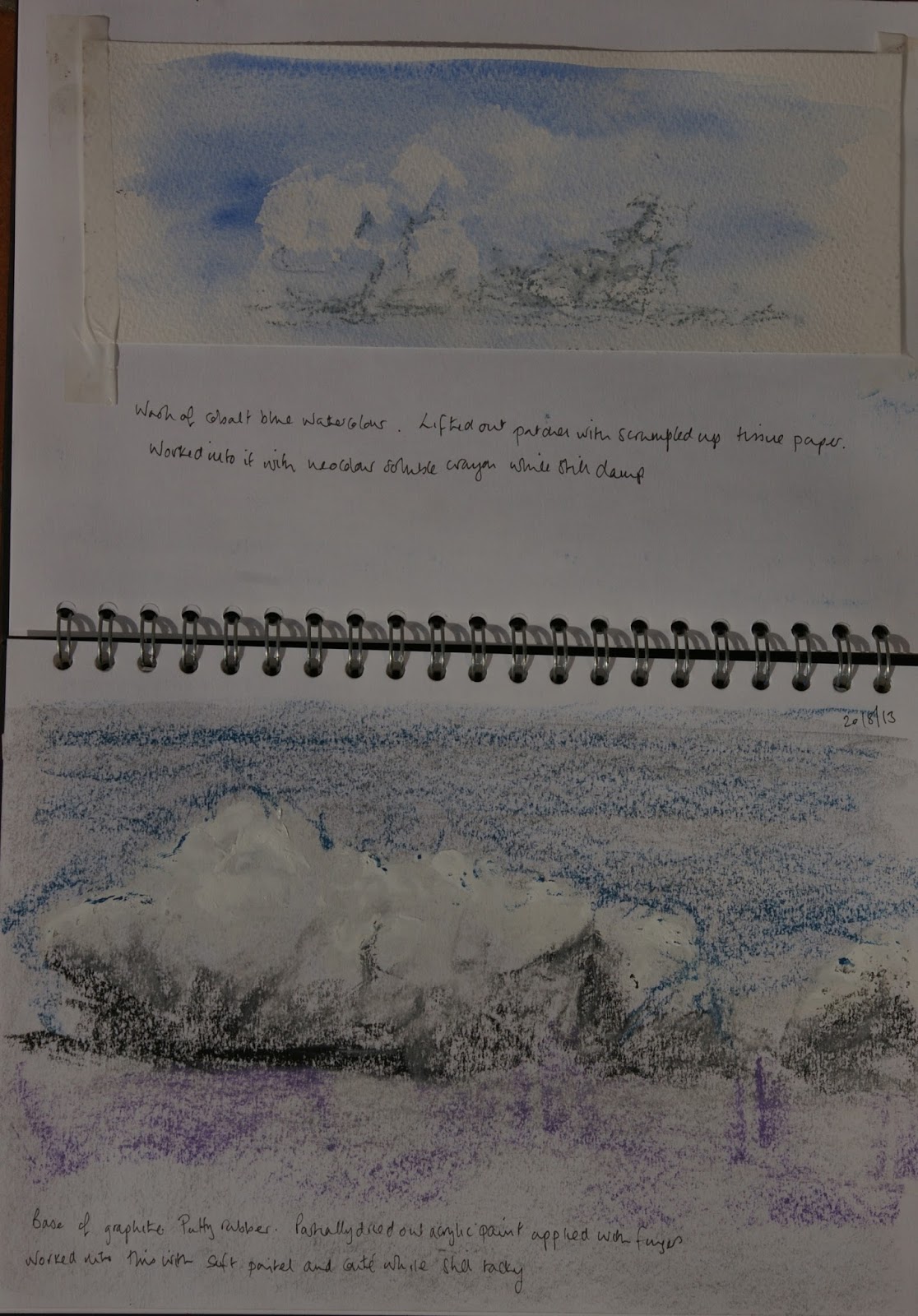
In the early 18th century the public's taste for the picturesque was dictated by models of idealised landscapes from 17th century painters (see part 1 of this research point). As the 18th century wore on, before the invention of the portable camera, it became common for tourists to carry a 'claude glass' which was a small mirrored device which allowed the carrier to select a view and see a flattened image.

In the later eighteenth century, tastes began to change. The previously favoured 'ideal landscape' started to look boring and staid. The landscape had been tamed and view of different places started to look very similar to one another. This took landscape art in two different directions in search of novelty. Firstly, artists went to more wild and remote places in search of sensation and wilderness. Secondly artists sought out new ways of representing familiar landscapes.

The 17th century artist Salvator Rosa was the forerunner of the 18th century artists' preoccupation with the sublime. His landscapes were wild with dramatic scenery and weather conditions.(1)


Salvator Rosa: Bandits, Wilderness and Magic

Salvator Rosa: Landscape with a Huntsman and Warriors


Edmund Burke's "Enquiry into the origin of our ideas of the sublime and beautiful" had a profound influence on artists in Europe and North America and was a stimulus for many artists' enquiries into the sublime.

What is the sublime? its true definition is the subject of debate and it is a word which is overused in everyday vernacular to mean something fabulous or wonderful which dilutes its true meaning somewhat. Originally it was intended ti mean something of such greatness as to be overwhelming to the senses and the rational mind.  Burke says "The mind is so entirely filled with its object that it cannot entertain any other; nor by consequence, reason on that object which employs it. Hence arises the great power of the sublime, that, far from being produced by them, it anticipates our reasonings and hurries us on by an irresistible force" 
Burke talks about , obscurity, darkness, vastness, magnificence and suddenness. Many of these terms are almost diametrically opposed to the qualities values in the structure and taming of landscapes by Claude and Poussin. 

Our reaction to the sublime has been described as a 'sort of delightful terror' (like a reaction to a horror film or a ride on a roller coaster). The sublime itself is actually defined as being un-representable (by Kant) but landscape artists seeking to represent the sublime have sought to do so by means of storms, avalanches, chasms and volcanic eruptions - high drama in other words.

Here are some examples of works seeking to represent the sublime:

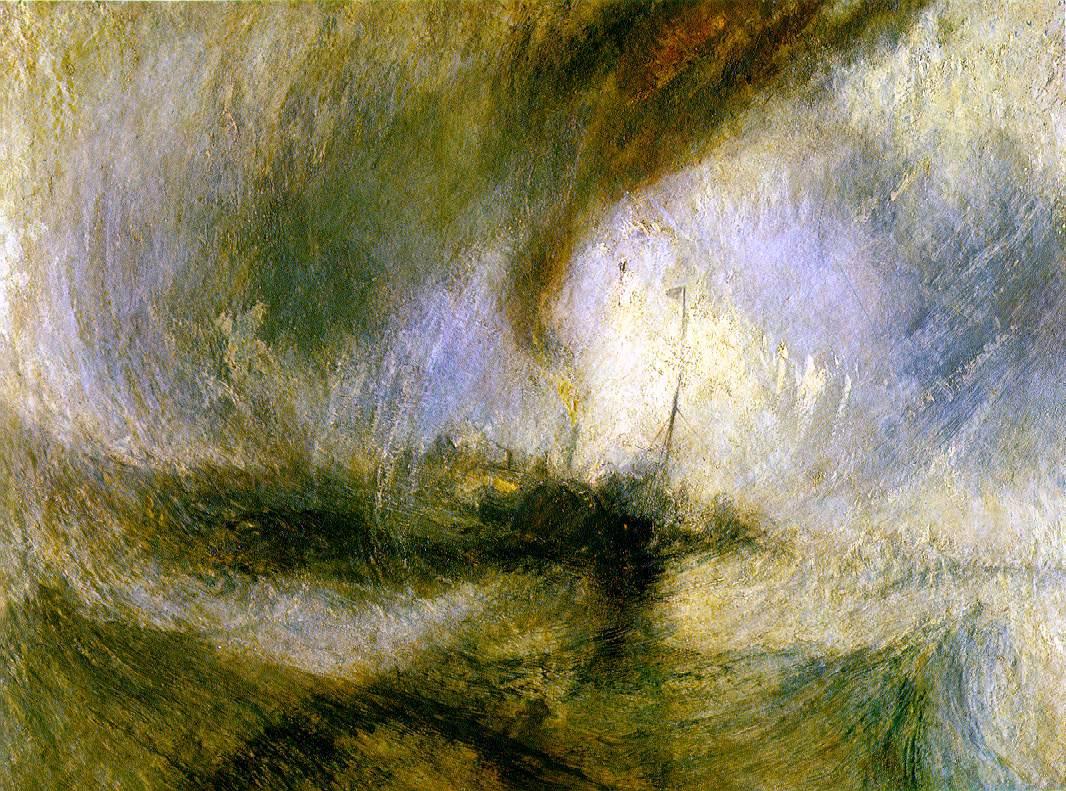
J.M.W. Turner: The Shipwreck 1805

Phillipe Jacques de Loutherbourg: An Avalanche in the Alps 1803

Caspar David Friedrich: Wanderer above the Sea of Mist 1818

Caspar David Friedrich: The Monk by the Sea 1809


The spectator in the above paintings was not involved in the action but an onlooker to the peril of others or the overwhelming of others by the vastness of the space they behold (Friedrichs' the Monk- I particularly like this painting the spareness of it and the smallness of the monk contrasted against the vastness of the sea and sky) . In Turner's later work he would also try to give the impression of the spectator's involvement in the action by altering the composition such that the viewpoint seemed to be within the action (2)(3) (See the research point on Claude Lorrain and Turner for an example of this).

A passage which I particularly like in "landscape and Western Art' by Malcolm Andrews which articulates the difference between the picturesque and the sublime is as follows:
"The Picturesque had employed a vocabulary of appropriation and transformation in negotiating its relationship with the natural world: natural materials were processed into aesthetic commodities -'landscapes'. The Sublime eludes the impulse to consume in the sense just described: it is pictorially unframeable, and it cannot be framed in words. The Sublime is that which we cannot appropriate, if only because we cannot discern any boundaries. If anything, it appropriates us. The vocabulary associated with the experience is one of surrender to a superior power- the very reverse of the Picturesque. In the act of surrender we acknowledge the feebleness of our powers of articulate expression and representation. We surrender ourselves, or at least the self that is constituted by language is dissolved."

Another way that artists tried to overwhelm the senses was to surround the viewer with the image. The artist had control over the viewer's environment by completely enclosing them in a diorama or a panorama. An example of this was Louis Daguerre's diorama of Mont St Gothard which was exhibited in 1830 which included a real Chalet and live goat. 

A further development  in landscape painting may also have developed as a result of the Kantian description of the sublime as something which cannot be represented. Jean-Francois Lyotard talked about this in relation to the avant grade art of the 20th century. (1) If something cannot be represented by the current visual language then it requires a new vocabulary. Cezanne agreed with this:

"the Louvre is the book in which we learn to read. We must not, however, be satisfied with retaining the beautiful formulas of our illustrious predecessors. Let us go forth to study beautiful nature. Let is try to free our minds from them. Let us strive to express ourselves according to our own personal temperaments" (1)

According to Lyotard, the work of the avant garde was associated with an aesthetic disturbance in the viewer such that even the familiar could provide an experience of the sublime:

" The art lover does not expect a simple pleasure, or derive some ethical benefit from his contact with art, but expects some intensification of his conceptual and emotional capacity, an ambivalent enjoyment. Intensity is associated with an ontological dislocation. The art-object no longer bends itself to models, but tries to present the fact that there is an unrepresentable" (1)

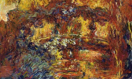
Among other artists, Lyotard wrote about the work of Cezanne. Cezanne is thought of as the father of modernism and was concerned with developing a new language or vocabulary of art as he indicated in the quote above. He wanted to convey sensations in paint. These could not adequately be described using traditional methods. This was a common aim with that of the impressionists (and in fact in his early days he exhibited with the impressionists). They were all concerned with representing the familiar in a different way from their predecessors. This follows from the notion that 'the sublime happens anywhere, once the film of familiarity is lifted or pierced' (1) I realise that my understanding of this is very rudimentary and this is much more complicated in terms of philosophical argument but greater depth is beyond the scope of this research point.

So in the late 1800s the work of the impressionists tended to concentrate on scenes from everyday life which included townscapes and landscapes. Their treatment of these scenes was aimed at capturing their momentary impression and being 'true to nature'. I will talk more about this in the research point about artists who worked in series with the landscape. 

Pierre Auguste Renoir : Oarsmen at Chatou 1879


Gustave Caillebotte : Paris Street Rainy Day 1877

Cezanne was even more ambitious. He wanted to convey his sensations when observing nature directly but he also wanted to turn 'Impressionism into something more solid and enduring, like  the art of the museums' (4)This is a difficult contradiction to balance and caused him some difficulty in his quest. I will return to Cezanne in the research pointy about artists who worked in series with the landscape.

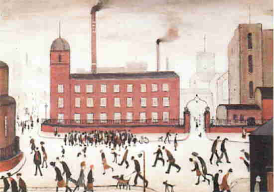
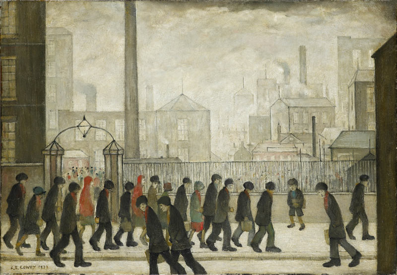
My next research point however moves to a British artist who was influenced by the Impressionists in his desire to paint scenes of modern life. Namely L.S. Lowry.

References:

(1) Landscape and Western Art. Malcolm Andrews. Oxford History of Western Art. Oxford University Press 1999

(2) Turner, Monet, Twombly Later Paintings (Exhibition Catalogue). Jeremy Lewison. Tate Publishing 2012

(3) J.M.W. Turner Sam Smiles. Tate Publishing (British Artists Series) 2000

(4)The Story of Art. E.H. Gombrich. Phaidon (reprinted 2011)